How We Work
Our work is led by strategy, which guides all creative decisions that follow. Each layer of a project builds on the one before it, moving outward and shaping how each service comes to life. What we deliver in the end is rarely just one service, but a tailored combination of many working together. This process is how we create solutions that are both elevated and inevitable.

Virgin MusicBranding & Identity
Reinvigorating the storied brand to reflect the attitude and expression of their new strategy.
Services
- StrategySee Strategy projects
- Branding & IdentitySee Branding & Identity projects
- DigitalSee Digital projects
Overview
We worked with the Virgin Music Group team to reimagine and reinvigorate their brand to reflect the attitude and expression associated with their rich history as an avant-garde label. Our visual identity was a direct result of our strategic platform — that Virgin Music always has been, and always will be, in service to the artist, and that artist ownership is paramount. The identity conveys this with an irreverent and bold “stamp-esque” logomark that can easily be placed on top of, and therefore obfuscate and own, any design elements except the names of artists. The visual system accurately reflects the soul of Virgin Music and extends across all touchpoints, uniting the brand messaging and transforming VMG into more than just a label — but a true cultural platform for artistic expression.


Mineral HealthBranding & Identity
Creating the world's premier hemp-based health brand by infusing apothecary warmth with luxurious elegance.
Services
- Branding & IdentitySee Branding & Identity projects
- Creative DirectionSee Creative Direction projects
- Packaging & SeedingSee Packaging & Seeding projects
- DigitalSee Digital projects

Overview
Mineral is a revolutionary plant-based wellness brand that uses all components of the hemp plant to create proprietary topical and sublingual formulations. Since the brand’s inception in 2016, we’ve worked alongside the internal team to craft an ownable, elevated brand identity and design language. Mineral’s products have been named to GQ’s Best Stuff list, and the brand and packaging has been recognized on the Die Line, Visual Journal and has won a number of visual identity awards. We continue to work with the brand on every touchpoint, from packaging design to experiential projects like the recent concept store.


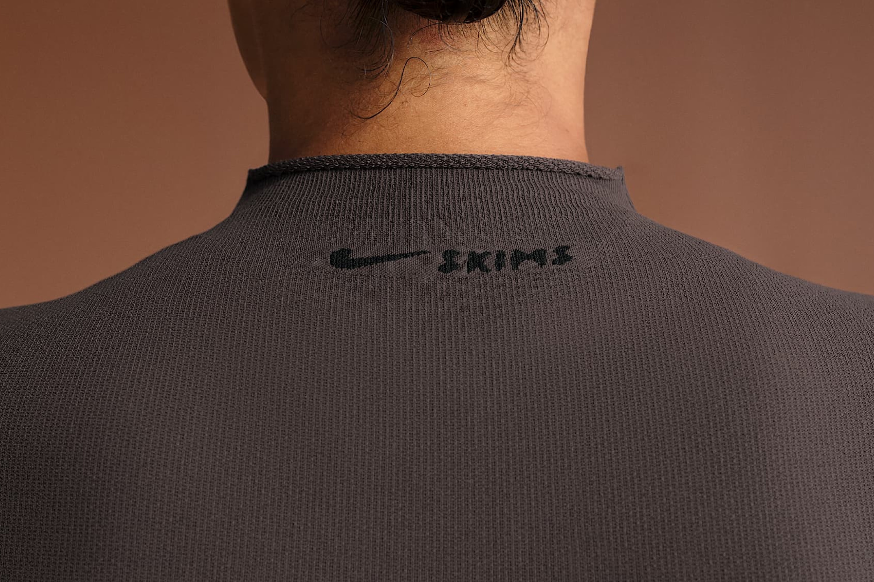
NikeSKIMSPositioning & Identity
Setting the tone for a new expression of sport, sculpted for the body and engineered for performance.
Services
- Brand PositioningSee Brand Positioning projects
- Branding & IdentitySee Branding & Identity projects

Overview
NikeSKIMS reimagines athletic apparel through the lens of the body. Designed to sculpt and built to perform, the brand merges Nike’s legacy of innovation with SKIMS’ mastery of form, comfort, and everyday ease to define a modern expression of movement. WØRKS partnered with SKIMS during the early stages of NikeSKIMS’ development, as the brand strategy and visual foundation were taking shape. As a trusted creative partner, we helped establish the balance between two distinct yet complementary identities, guiding early creative direction and positioning that would inform how Nike and SKIMS could exist as one. Our strategic work focused on defining shared values — innovation, freedom of movement, and cultural equity — as the connective tissue between the brands. This framework set the foundation for a visual identity that united Nike’s performance heritage with SKIMS’ refined approach to body-centric design. The resulting approach would define the visual language of NikeSKIMS: a global brand reimagining sport through an obsession with the body, designed to move with purpose and without compromise.


erthosBranding & Identity
A timeless visual platform evoking feelings of trust, expertise, and a sense of optimism for the future.
Services
- Branding & IdentitySee Branding & Identity projects
- DigitalSee Digital projects
Overview
erthos® is a biomaterials company reimagining the building blocks of plastics. Alongside the erthos® leadership team, we created a cutting-edge and robust visual identity system and website. Coinciding with a shift in business model from a materials supplier to a fully integrated, technology-driven material studio, we worked to concept a timeless, polished visual platform that would evoke feelings missing from the sustainability landscape: trust, true expertise, and a deep sense of optimism for the future. These values come across readily through the emotive imagery, sophisticated typography and layout, modular data design, intentional color usage and a clear and concise logo system.


NikeKobe Sportswear
Introducing a lifestyle category under the Kobe brand through a focused and elevated launch of the Air Force 1 Protro.
Services
- Branding & IdentitySee Branding & Identity projects
- Creative DirectionSee Creative Direction projects

Overview
Nike partnered with WØRKS to define and launch Kobe Sportswear, a new lifestyle extension of the Kobe brand that brings his discipline and ethos into everyday wear. The inaugural release, the Air Force 1 Low Protro, marked the beginning of this transition from performance to off-court culture. We were tasked with positioning the product and Sportswear initiative as a transference of Kobe Bryant’s mindset from the athlete to the culture maker. Our strategy centered on “The Work You Don’t See,” inspired by a formative, private moment that inspired this colorway of the AF1 Protro: Kobe himself, with a broken right hand, shooting in the gym, at 4:00am, alone in his pajamas — with his left hand. It’s an iconic moment in the lore of Kobe now — but began as one that was never meant to be seen. This microcosm is proof that the mindset with which greatness is built is rooted in quiet, unseen repetition. “The Work You Don’t See” became the foundation for both narrative and visual direction.


Converse'Love, Chuck' Platform
Creating a worldwide cultural platform that leverages the iconic Chuck Taylor as a canvas for creators.
Services
- StrategySee Strategy projects
- Branding & IdentitySee Branding & Identity projects
Overview
Converse engaged WØRKS to define and build the strategic and structural foundation for a new brand platform. The goal was to position the Chuck Taylor as a central cultural symbol and a canvas for authentic community expression. Recognizing that Chuck Taylor shoes have been synonymous with culture creators across generations, the Love, Chuck platform was designed to celebrate and amplify this spirit — not as a one-off campaign, but as an evergreen platform for global storytelling. From strategic positioning and tone of voice to visual identity and activation frameworks, we worked closely with Converse to create a nimble system that could champion diverse voices and foster cultural conversations in markets and languages across the globe. Love, Chuck ensures that the Chuck Taylor’s legacy is not only preserved but continually redefined by the people who live and create in Chucks.


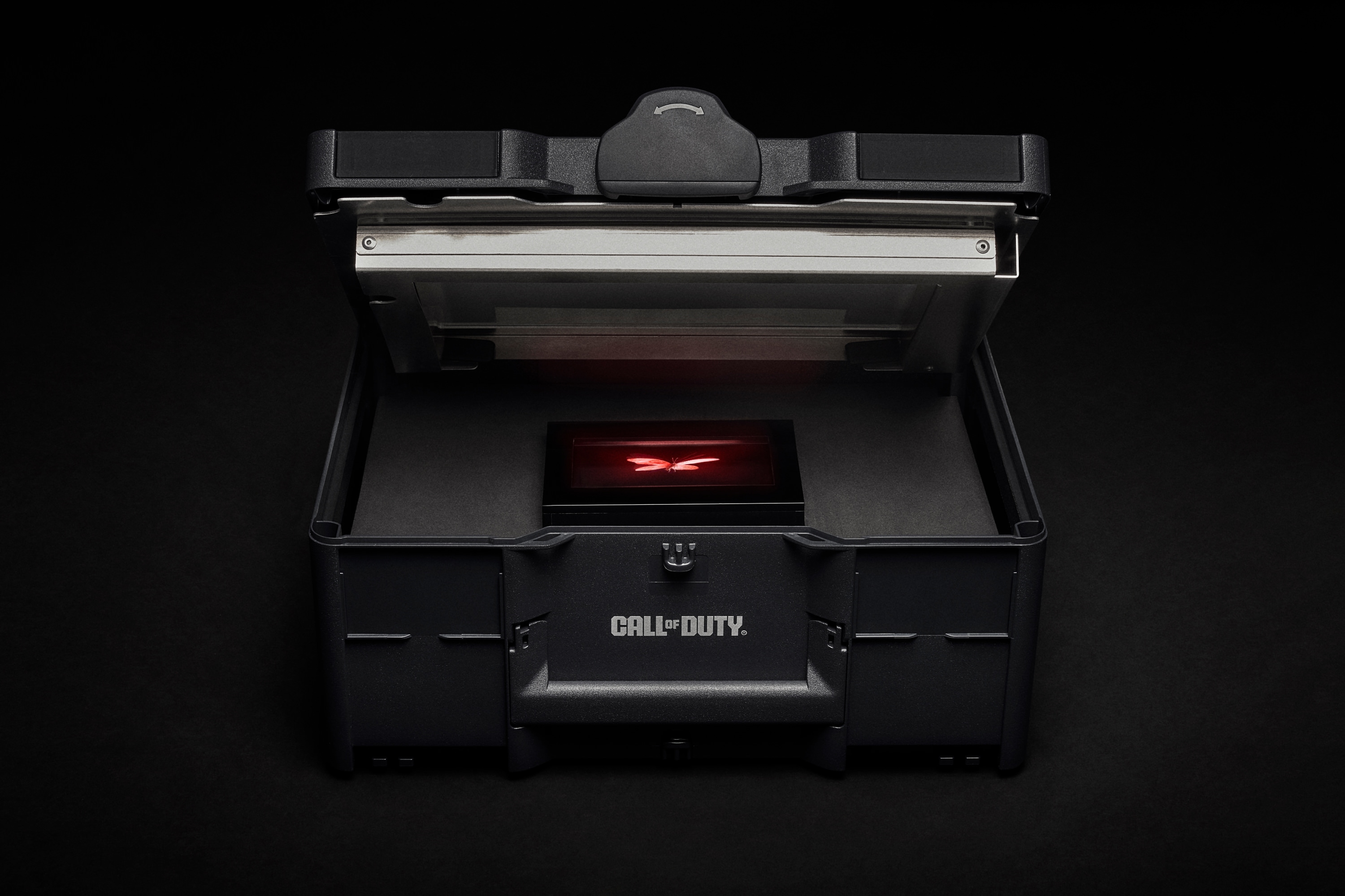
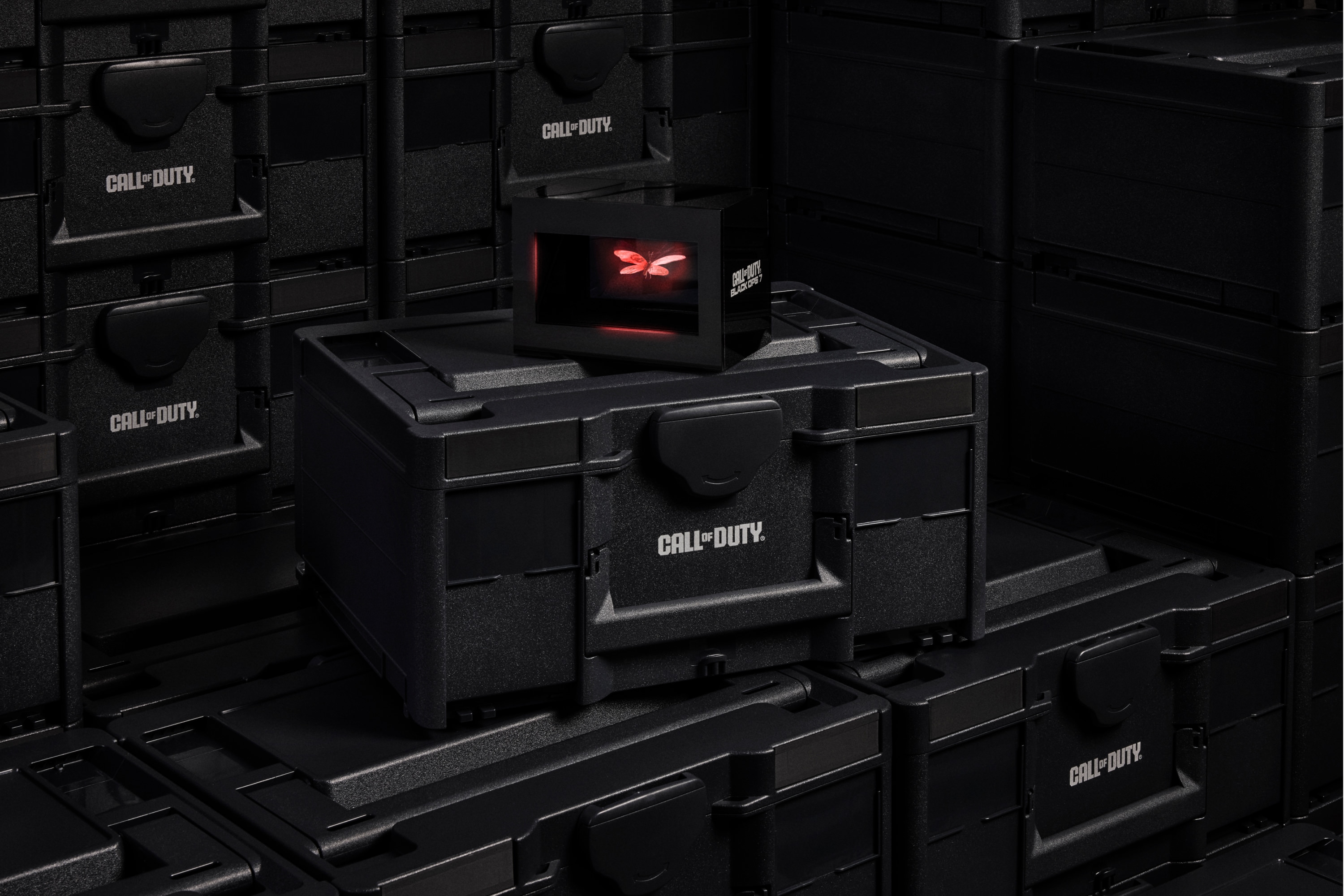
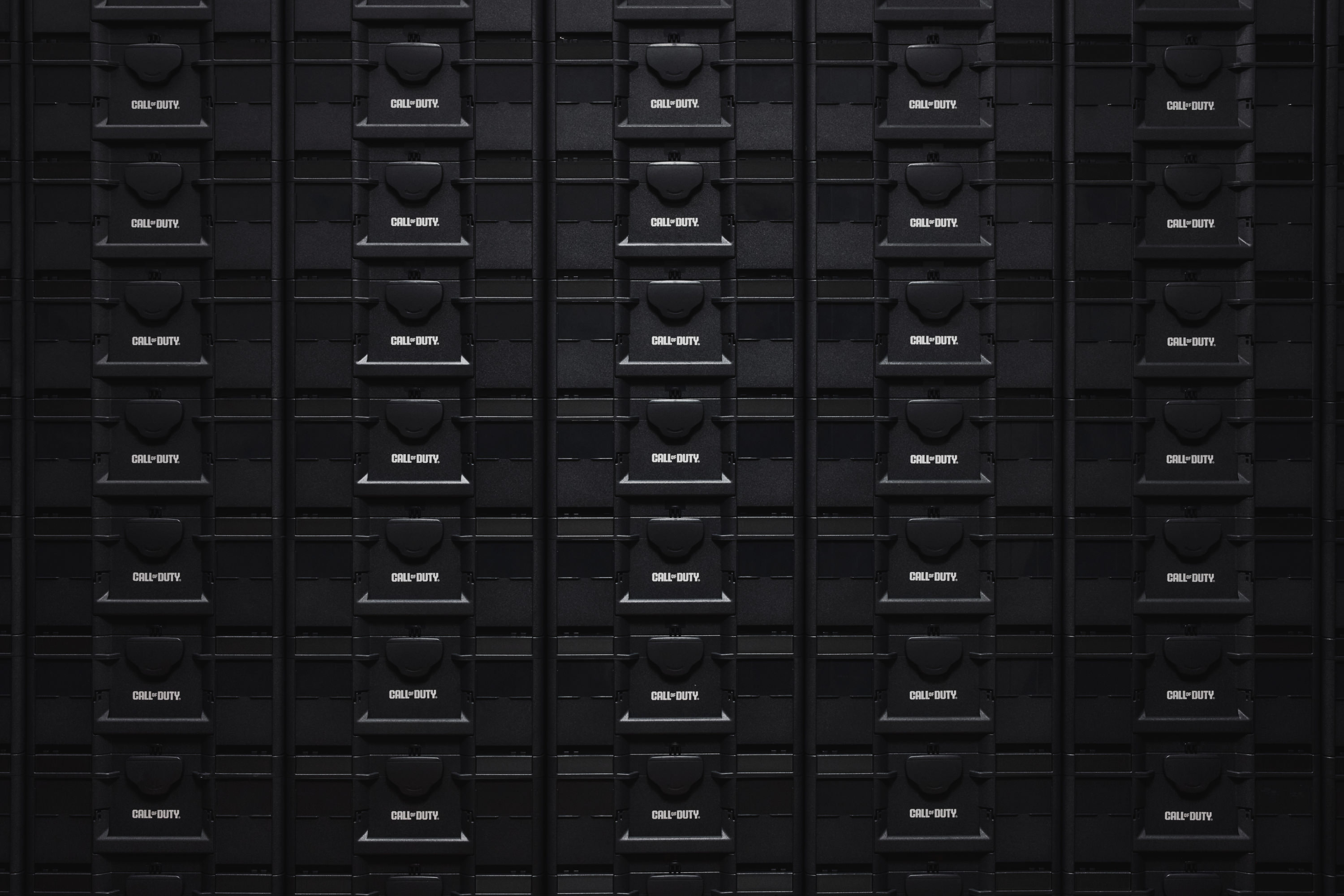
Call of DutyNEXT '25 Event Invite
A physical invitation that distorts reality to build anticipation for the next Call of Duty title.
Services
- Packaging & SeedingSee Packaging & Seeding projects
Overview
WØRKS partnered with Activision to create the invitation for Call of Duty NEXT 2025, the annual event where players, pros, and creators come together to experience the franchise’s newest release. Rooted in Black Ops 7’s central themes of illusion, mistrust, and perception, the invitation brought those themes into the physical world. Recipients unlocked a custom black crate to find a glowing privacy screen that obscured what was inside. A coded lock and hidden message with the event’s date invited them to unlock the rest of the experience and reveal the center piece: a holographic red butterfly drawn from the game’s teaser trailer, suspended in motion as it dissolved into smoke and reformed again. The object functioned as both invitation and display piece, designed for creators to feature across their streams and social channels in the lead-up to the event. Developed with NYC-based fabrication studio Counterpart, the project merged storytelling, technology, and fabrication to extend Call of Duty’s world beyond the screen and into the hands of its most dedicated players.
NikeStudio45
Scaling back the superfluous to create the premier training and activation gym for Nike NYC.
Services
- Experiential DesignSee Experiential Design projects

Overview
We worked alongside Institute to redesign Nike’s elite 45 Grand St. facility. Our goal was to create a progressive and functional fitness experience, along with a compelling space for brand activations. The concept emphasized the ability to adapt to any activation, from a group fitness class lead by a Nike instructor to a product launch press experience. We employed the use of movable set pieces and thoughtful storage use to repurpose rooms throughout the space. The use of raw, deconstructed materials signified a form-follows-function approach.


American EagleLive Your Life
Reviving the American Eagle manifesto through thoughtful type and identity design for a global campaign.
Services
- Branding & IdentitySee Branding & Identity projects
Overview
To help launch American Eagle’s refreshed brand platform, we partnered with Los Angeles-based creative agency Acre to carve out an iconic identity that has quickly cemented itself as a modern classic. The revival of the 20-year-old slogan Live Your Life marks a return to form for the brand. More than just a campaign, this revival is a foundation designed to endure for years to come.


